By Dr. Charles Patterson, WCI Columnist
For the last several years, the good folks over at the Thrift Savings Plan (TSP) have been hard at work giving their program a facelift. Among other things, this overhaul means quicker access and ease of use. With the facelift has come a tummy-tuck: a fancy-dancy new TSP mobile app to accompany it. Today, I will be reviewing these changes and showing you how to use them.
The beloved TSP—ostensibly the 401(k) plan for service members and federal employees—is a legacy system built on a proud tradition of slow change and cumbersome interfaces. Putting on my critic hat, you should know two things about the wearer: 1) I enjoy personal finance and running numbers, and 2) I don’t mesh well with technology. To the latter point, I can barely spell “PC” and wouldn’t care to try. Until several months ago, I was content with my iPhone 3 (It broke, as all gadgets do, and I had to get a fancy-dancy new one at an exorbitant cost).
Until about the same time, I didn’t fully understand what an app was, let alone where the App Store was located (next to the Apple store, perhaps?). I believe true innovation to be rare, with claims of it too often made by turtleneck-donning charlatans. If a computer told me a probable diagnosis but my exam suggested otherwise, I would invite the computer to kindly leave. Technology saves lives, they say. Humbug, says I.
It is through this lens that I will be examining this new TSP technology. I am sure that this is going to go well.
The New TSP Webpage Is Inviting
Simply put, the new TSP webpage has a fin-techie new look. Its subtle color palette and soft fonts allay concerns that your financial journey is complicated. It is enticing and reminiscent of the platforms found with any of the other big firms. I dare say it is even more user-friendly. This is both good and bad, and as such, it can be construed as a “complisult.”
I suspect that this format is more familiar to younger folks. This is a good thing, as financial literacy and ownership of one’s financial health are to be embraced and encouraged. But there is a caustic lining: with ease of use comes ease of change, and this evolution runs the risk of making it too easy to change one’s portfolio.
The New TSP Webpage Is Easy to Access and Navigate
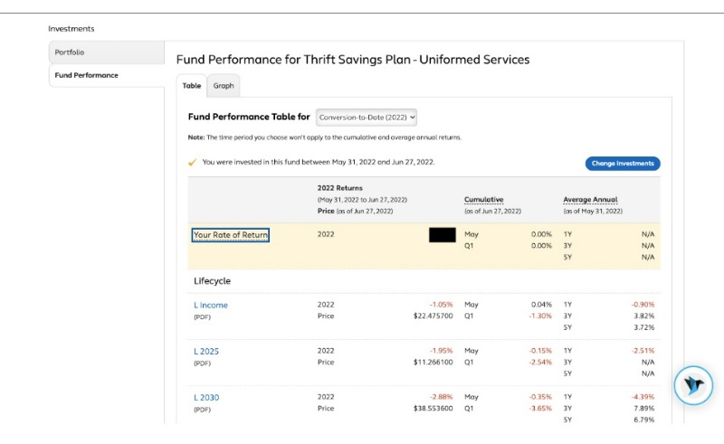
As many fellow elder public servants may recall, accessing the TSP used to be a fraught misadventure. Should you forget your password, you could make an online request for it, but it might take two weeks to receive it in the mail. The same goes for the PIN number and username. It's no exaggeration to say that if you forgot your password or had your account locked, it may take a month to gain access again. Not so with the new webpage: a two-factor, SMS-confirmation login makes access simple, just shy of enjoyable. Within milliseconds, you are logged in and can see everything from current balance to fund performance. It is quite nifty that way.
In the bottom right corner of each page is a hummingbird icon that, when clicked, launches an instant chat feature called “AVA.” Within this chat function, you can receive live help, something that is also new to the TSP. Full disclosure: I have not used the help chat function, but this seems to be a tool that mirrors other large firms' web pages (Vanguard, Schwab, Fidelity, etc).
If you are looking to make a change to your portfolio, it has never been easier. I am unconvinced that this is a good thing.
More information here:
What You Need to Know About the Thrift Savings Plan (TSP)
The New TSP Webpage Offers New Functionality
From the main login page, one has the option to view the portfolio, change settings, see account activity, view statements, and review beneficiaries. Also on the login page—and disturbingly on nearly every single other page—is the option to change the portfolio. More on why that is hazardous later.
In the meantime, one feature that is particularly interesting is the automatic balance, otherwise known as the reallocation. With the click of a button, one can rebalance the portfolio to the allocation that one wishes. No more Excel spreadsheets, no more math. Changing contributions manually has never been easier, with the full bevy of excellent TSP lifecycle funds, securities, and indices available from which to tinker. It is easy to tinker, too easy.
Perhaps the largest change in this evolution is the introduction of the “Mutual Fund Window.” While the standard funds from which to choose are still available, investors now have the option to direct their savings to 5,000 different mutual funds through an inter-fund transfer.
As a bit of background, the Federal Retirement Thrift Investment Board (FRTIB) has been looking at the question of opening outside funds to government employees for more than a decade. Legislation that first permitted the TSP to open the Mutual Fund Window was passed in 2009 (Thrift Savings Plan Enhancement Act of 2009, Public Law 111-31, Division B, Title I, sec. 104 codified at 5 U.S.C. 8438(b)(5)(A) in case you are interested). The FRTIB director, in conjunction with the Employee Thrift Advisory Council (ETAC) then directed a 6-year-long study on the implications of such a change.
Happily, in July 2015, the Board considered the results of the study and voted unanimously to adopt the window. Administrivia, cogs and wheels, Rube Goldberg complexes, magic, and seven (yes, seven) years later, we arrive at the execution of the decision. That’s correct: it has taken this governmental organization 13 years to open a Mutual Fund Window. If that doesn’t inspire confidence in bureaucracy, I don’t know what will.
The decision may be somewhat null, as the Mutual Fund Window offers more choices but seemingly fails to convincingly prove superior over existing TSP funds. Details on the 5,000 available mutual funds are forthcoming, but the parameters of the Window may make it a non-starter. To even opt in to the Mutual Fund Window, one must consider several rules and fees:
- The initial investment must be at least $10,000
- The initial investment cannot exceed 25% of one’s account balance
- One must have an account balance of at least $40,000 to participate
- There is a $55 annual administrative fee and a $95 annual maintenance fee in addition to fees associated with the selected funds
- Each trade costs $28.75
From the start, then, this Window would only be useful to those who have served for quite some time: it would take at least two years of service (assuming one maximizes their TSP contribution) to even be eligible to use it. For the average enlisted person contributing 10% of their income to the TSP, it would take over a decade to reach Window eligibility (and if there’s anything we’ve learned about the TSP and a decade, it's that rules actually can change in that timeframe).
At a minimum, one will be spending $178.75 for the first trade (1.8% if the minimum of $10,000 is used). Thus, the $178.75 question becomes: “Is it worth it?” To some, it might depend on the fund being used. But this would imply that the change would result in a higher return than can be achieved with a low-cost Lifecycle Fund or the classic C, S, and I Funds. I am unconvinced that such a change would be so beneficial—particularly in the long-term—and especially with the associated fees. In the words of Charles Barkley: “I could be wrong, but I don’t think so.”
The TSP touts a new suite of services designed to increase efficiency in withdrawals, distributions, and account queries. These include the aforementioned AVA, a new Secure Participant Mailbox, and the ThriftLine phone service. Loans and Legal Processing (conservatorship, guardianship, Power of Attorney) have changed only minimally. In all, the TSP appears contemporary, tuned, and detailed.
More information here:
Patterson: 5 Questions to Consider Before Changing Your Investment Portfolio
The TSP Mobile App Is Fancy Without the Hassle of Functionality
In June 2022, the TSP launched their app called “TSP,” and it is available in the App Store (not next to the Apple store). With the new app, one gets the fancy new font that we have come to enjoy with the webpage, all from the comfort of your phone.
And here’s the utility: imagine for a moment that you are in a standard social situation—you're in an elevator, boarding a plane, scrubbing in for the OR—and to your horror, you’ve exhausted your social media, news, and even medical literature review. Do you make eye contact and start a conversation with an acquaintance or friend? God, no! Here enters the TSP app: one more useless distraction that feigns important engagement to save you from a human experience.
Transaction capability is exceptionally limited—most significant account changes and questions will require you to log onto the TSP webpage. The only real function seems to be the ability to see one’s account balance and allocation in real time.
Things Were Better Back When They Were Tough
Grumble, grumble, harrumph! The new face of the TSP is fancy[dancy] with new functionality of arguable utility. For the long-term investor, these changes are of little value given their lack of applicability and the increased risk of inordinate change. More dangerously, for the young investor on the path to financial literacy, the risk of inordinate portfolio change is even greater, given the ease of access.
With a written financial plan in place, changes to a portfolio should be few and far between. Furthermore, it's likely that the high cost of inter-fund transfers will dissuade most folks from using the Mutual Fund Window, a portal that is equally incapable of efficiently executing frequent trading. In the good old days, you couldn’t even access your portfolio to change it. Now, if you have a tempting, terrible thought, all that separates you from an inane misstep is a few clicks. Bring back the snail mail passwords, I say!
All old man-ing aside, one function not included in the above review is the educational value of the webpage. Without question, the interface is more user-friendly, and the resources are more robust. In turn, this leads to greater engagement, and on the whole, that is a very good thing. I am a fan of any instrument which facilitates financial literacy, particularly in young adults. For this reason alone, I would give the TSP refresh my endorsement.
Success in personal finance need not be complicated. Time, attention, and habitual saving are the main ingredients of the recipe. All else is flavor. It may be fun to have more functionality, but that increased functionality is one more thing to break—there’s a reason tractors don’t come with adaptive cruise control.
You probably wouldn’t drain a skin abscess with a DaVinci robotic surgery system. The upgraded TSP features some shiny, but unnecessary, new services that long-term investors won’t ever use. What is nice to see is the attention that was paid in creating the digital interface and the promise of increased, efficient service. After all, it's not the DaVinci that conducts the procedure—it's the team wielding it.
Have you used the new TSP website and app? What do you think? Do you have any tips and tricks to make the experience even better? Is it now too easy to change your allocation? Comment below!
[The views expressed in this article are those of the author and do not reflect any official position of the Department of Defense or the US government. These writings are not authorized, approved, or endorsed by any of the above entities.]
Delightful post! Also a Luddite curmudgeon, I agree with the entire article. Hopefully the mutual fund choices will keep more folk using TSP when appropriate than before, and the exorbitant cost is the actual cost rather than some padded method of getting funds for any other reason (I acquit TSP of funneling profits to some greedy individual, and understand why they couldn’t farm out the whole process to Vanguard or FIdelity (government contracts/ favoritism), but I bet that $178 first trade pays for a whole new building full of administrators added to the TSP staff at much hgiher expense than private companies would tolerate).
Glad now to no longer wait 2-4 weeks if I lost my password, and no more need to send in a piece of paper and hope it adjusted my contribution in time to max it for the year.
The old website was adequate for what I needed to do: see my balances and adjust portfolio allocation. This new website is fancier. However, it is not intuitive and not necessarily easier to use. If I just want to see my portfolio balances and holdings I have to make like 3 clicks and hunt for each one of them. They did change rebalancing so that you could specify a dollar amount for each fund instead of a percentage, which is nice.
The new TSP app seems to be taking a lot of power/options away from users! It is NOT giving the user the ability to check against historical performance for prior months and years! It does NOT displays the amount of General Loan and the Loan Rate that users qualify for. There are many more deficiencies and lacks compare to the Legacy TSP! It almost seems that app designer did NOT like the users to have as much power & information. It’s only good for dumb users and I don’t care how fancy & fast it looks like when user logs in.
Not a fan of the conversion to the new TSP website.
They deleted all of my beneficiary designations and eliminated all historic portfolio performance date prior to the end of May 2022. Finding the mix of employee traditional, employer traditional, and employee Roth in my TSP is harder than it used to be and takes several more steps.
TSP has been authorized by Congress to allow in plan traditional to Roth conversions for years. This somehow is “too hard” for the Thrift Savings Board. Deleting beneficiary designations for me and many other TSP participants was easy enough though. (You know some poor unfortunate TSP participants have died before getting their beneficiary designations re-established and likely had pay outs to the estate instead of a trust or similar disaster from a tax efficiency and asset protection point of view.)
I’m glad I read your comment. I hadn’t checked my beneficiary info since the update and they deleted mine as well! They need to get the word out better about that.
On another note I find it weird they require a witness for designating a beneficiary. Never had to do that for another account that I remember.
I can’t even get the add witness function to work on a Mac using Chrome. Maybe I’ll try a different computer/browser at some point.
I may have to go in and take a look at my beneficiary designations now to make sure mine transferred over.
Edit: Yup, my beneficiaries were wiped. To make matters worse, it now requires a “witness” to my beneficiary designation but the button to accept my witness doesn’t work. I can’t even update my beneficiaries if I want to.
The new TSP website is terrible.
1. Why not at least go back to Jan 1 of 2022 rather than May 26 if this yr as a start point.. Such an odd
date to use.
2. I find it cumbersome to get my balance for each fund.
3. The old website gave a clear look at each fund’s progress. It automatically showed you your total funds 12 month
Rate of return. The new one doesn’t.
4. I will probably transfer all of mine to Schwab or Vanguard.
I agree. I find basic info like returns and balances difficult to find in the new website. Thanks for the heads-up about beneficiaries – I need to check on mine!
The loss of all historic documents with no warning is the worst part of this. After all that work, this is the best they can do? They run excellent investment vehicles, but they can’t figure out simple stuff.
Hopefully they get the message and fix it. When the Utah 529 made changes, some were for the worse. They eventually got them right though.
Where are the calculators?
Whose brother in law created this piece of junk? Any junior high kid could have made a better system. Lost all my beneficiaries information. I moved most of my money out before the conversion. Due to the inability to sell the funds I wanted to. Pro-rata is still the reason to move your funds out. I will use the G fund as my cash bucket? Hopefully I can get funds when I want them in a timely fashion but I don’t have any hope it works.
I hate the new interface. First your homepage is loaded with advertisements trying to get you to move out of the core funds into the exchange to buy high fee funds. Second, basic information like how much you have in each fund isn’t available in the balances page (it literally only shows you the account balance). You have to menu dive to get to how much is in each fund. Once there there is so much white space that you can’t even view totals in each fund without scrolling. I wish I could opt into the old view 😭
For those who dislike the new interface and are talk I get about moving money elsewhere, I’d recommend keeping at least $1K or $5K in the TSP rather than closing your account outright.
To the extent that you want to hold bonds in a traditional account, the TSP is a pretty good place. The G fund can’t lose money on a nominal basis. (We certainly have seen real inflation-adjusted losses, but the G fund still is a unique entity.). You can roll money from a traditional retirement account and use the TSP’s G fund for part or all of your bond allocation.
On the old website there was a very nice interface that allowed users to modify their loan payment plan anytime. This was an extremely handy tool. I could not find this option in the new system and I’m afraid it is not an option anymore.
In addition, direct deposit additional payment of a loan took much longer than old check in the mail procedure. As a user I imagined the electronic transaction would be almost instantaneous but unfortunately it took them over a week to process.
That is correct about the loan repayment plan adjustments. I called them and they said that it’s not available anymore. Another example of change for the worse.
I am not quick to adapt to new systems. I find the new system much harder to navigate. One thing I miss about the old system is the easy ability to check your account balance on any particular date to calculate your gain or loss for any period.
AVA is not a “live chat”. On 2 occasions I received advice to visit 3 other topics that had nothing to do with my questions.
Not all that glitters is good. As recent retirees, my wife and I were taking a very modest monthly withdrawal from my account. Per Murphy, about the same time as the TSP ‘upgrade’ our situation took an unforeseen turn and we need a larger monthly amount. I have spoken with a TSP agent on three different occasions since June 1 ( the first after being on hold for over 4 hours) in unsuccessful attempts to increase my monthly allotment to the new mininum amount. Frustratingly, during the most recent call I asked if changing the automatic monthly withdrawal amount could be done on the website and was told yes. Over a month has gone by, an automatic withdrawal has been processed for the original amount, and I cannot find any information regarding automatic partial payouts on the new site – just pushes for annuity payments. Not a fan…
Well that was quite the opposite view of the dreadful new TSP make over. Let me start with the fact I cannot find relevant info without coming upon it by chance. The old page was pretty straight forward and offered simply calculators. It offered in real easy terms what you needed to find. As far as ease and speed we’ll this new site is neither so much so that I have reached out to my US Senator. Slow is an understatement and ease is a farse . Everything now must be done on line as I tried to get pages mailed so I could fill out and return but was told that is no longer an option. Ok, so next I try to ” simply” start a withdrawal . Couldn’t even make it past my spouses info before it froze. Waiting for over 55 minutes to get a live human who said they could help only to find out you need to import a financial institution at least 6 days prior to your request. After finally figuring out how to due this and waiting a week another call needed to be made ,as I said the system does not allow me to complete on my own. Another 58 minute wait and finally we were off to the snail online process and it was completed. Doesn’t stop getting irritating though. I keep seeing messages from the TSP and try to click on them only to be informed I have no notifications, “really “. So here I go again waiting 48 minutes only to be told you may need another computer to access your account properly. So the App and my andriod smart phone & tablet apparently aren’t fully compatible, isn’t that lovely. Not a big fan of the big false new roll out as now not much of anything can be accomplished without a real live TSP representative and as a retiree I can’t just go buy an Apple phone or computer so I may or may not access my account. TSP your new roll out is horrible and completely unusable in my situation.
The new website is miserably awful. You can’t even check your daily balance by date… ridiculous. The old site was easy and useful. The new site is unnavigable and useless. Those responsible for this travesty should be held accountable.
Hate this new tsp software they deleted my beneficiaries and now I can’t put them in. Called for help ,no help ! On hold to talk to a supervisor finally gave up. They we’re supposed to send an email witness form to be docu signed that never happened. The agents I talked to were nice but of little help need more training. Wasted a whole day and still can’t get beneficiaries on my account,why in the world did they delete them I’ll never know. Hopefully this will get fixed in the future because right now this upgrade sucks.
I’ve been trying for a month to apply for a tsp loan and I can’t get one because the updated their system and it put me in a non pay status when I’ve been working for 9 months now ,they won’t correct it until they receive a tsp41 form from my employer. I would say I’ve been on hold for at least 20 hours over the last month. Terrible system like the old one better.
Absolutely hate the new website. Not at all easy to navigate or intuitive. There is no explanation of what things do when clicked. I’ve gone round and round in circles trying to find my balances. Hard to determine the number of shares of the individual funds. They have lost or at least it is not available anymore of any historical transactions from before they implemented the new version. Can’t get my 1st quarter statement for 2022. The right hand chat help is a joke. Very Disappointed in the disaster that they have made.
Am so angry about this IMO cheaply designed, poorly implemented system I plan to construct a detailed letter to my representatives that no-one connected with this project deserves to pat themselves on the back or deserves any kind of bonus. I work for a data center so it wasn’t like I didn’t know how to fill out a form, but they lost my beneficiaries anyway. No kind of access to a .pdf of the original. Tools and capabilities I used to use are gone. The design looks like a cheap shopping phone app. Information I used to review vanished and we never even got a chance to at least download. You are no longer able to have a full suite of characters for user name and password, which is less secure and tells me the programmers just couldn’t handle something so basic – they changed my chosen user name. Messed up my mother’s beneciaries too. I loathe those useless bot chat things and that’s what is there now. There are so many things I despise my letter to my representatives will likely be 7 pages long. Shame on the TSP board and whatever amateur programming group implemented this – it’s so unprofessional it makes me nervous and I want to move my money.
Change without progress.
The new website is awful. I manually enter my transactions into Quicken and now it seems like I have to enter 3 different transactions every 2 weeks. One for my contribution, one for the 1% agency match and one for the rest of the match. It is hard to find the transactions. What was so wrong with the old website?
Going to echo a lot of the above comments – not happy with the change. I could care less about a ‘prettier’ website – other posters are right, the old one was ‘good enough’ for what it needed to be. Not pretty, not super easy, but good enough.
It is very disappointing to see so much ‘work’ and money go into this fancy new website and horrible new mutual fund options rather than any useful improvements. In-plan conversions, ‘mega backdoor roth’ contributions, etc. Not a fan and a waste of taxpayer money and servicemembers time/fees.
The mobile application’s app store rating sums up the whole experience nicely. Not sure if the author of this article was hired by the same contractor who built the new website.
The title says “I don’t love it” and you’re accusing the author of being a shill? Sounds like most of the comments are just saying Charles wasn’t negative enough about it! Seemed awfully negative to me, but I’m also pretty mad about the beneficiary thing. I mean I do NOTHING with my TSP and haven’t for years. It just sits in the G fund and that’s it. But screwing with the beneficiaries I just went to a lot of trouble to change a few months ago, that’s enough to make me hate the development team by itself.
I primarily miss the historical data… What good is just going back to May 26, 2022?
All in all, NOT a fan of the new site.
TSP investor since 1988.
Just got this email from the TSP:
Dear Participant:
You’re receiving this notice because we are unable to display your beneficiary information in the new My Account section of the TSP website. We want to reassure you that we still have any Designation of Beneficiary form that you submitted in the past. You can request a copy by calling the ThriftLine.
So it sounds like they’ve still got my old beneficiary designations, they’re just not showing them. So that’s reassuring I guess. Pretty incompetent though to not be able to figure that out before roll out. Whatever happened to beta testing something?
Yet another day of, “Sorry, this page is temporarily unavailable, thank you for your patience.” The new TSP website is the worst, clunkiest, most non-intuitive web site I’ve ever seen. However, I would like to thank the developers of this website for finally giving me the motivation to make an appointment with a financial services company in order to place my retirement funds with them. I can’t believe they Beta-tested their “new and improved” web site.
Not a fan of the new website. Trying to find contributions made and the amount of shares purchased by fund is like trying to find a needle in a haystack. The old website I was able to see my contributions easier and shares purchased for each fund. The new site is way to busy. The new site needs to be simplified to like click here to see contributions made, etc.